We've mixed ingredients from former series' and baked them into with new elements to develop a clean and conventional look. Let's get whisked away with these five new templates.
You may notice that this series nicely compliments the topographic series with similar elements whisked together.
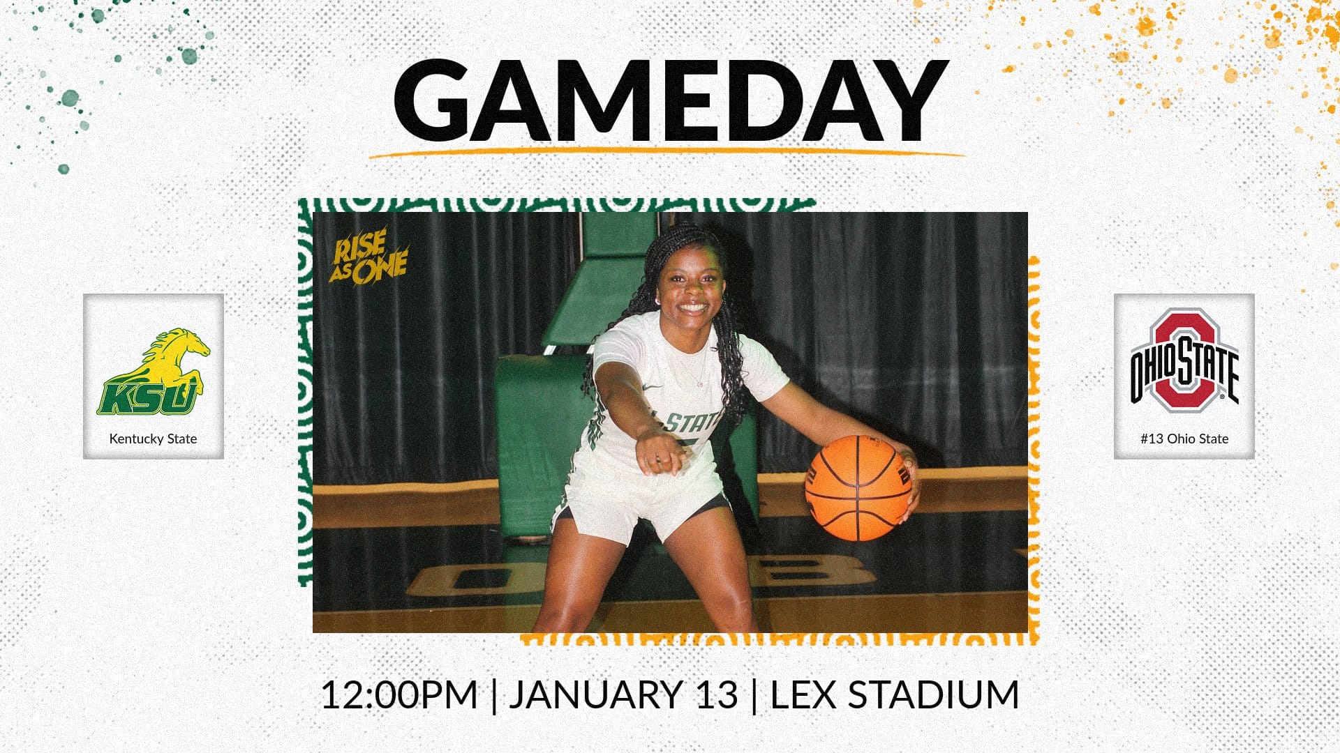

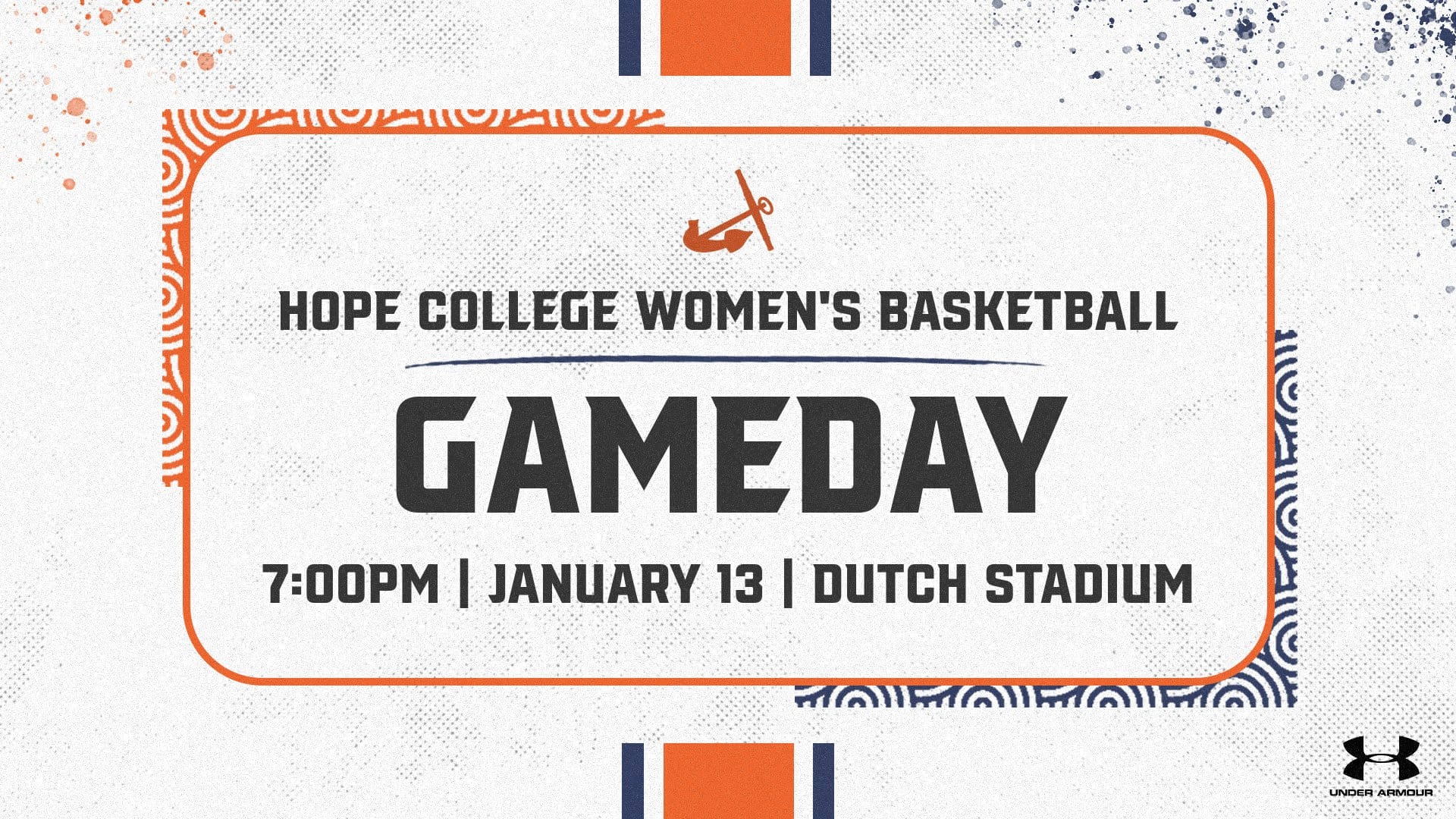
Wether it's for a gameday, an event or breaking news, this versatile, headline template can be creatively used for many different needs. No photo, no problem as this template is all text-based where the elements and colors do all the talking for you.

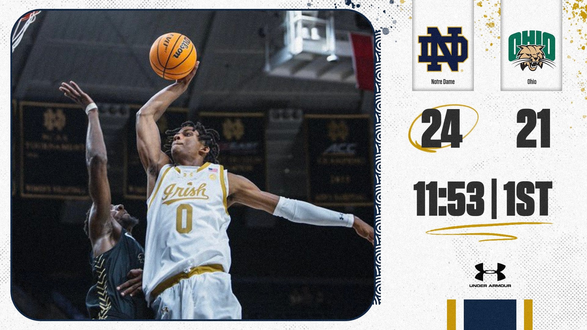
Elevate your team scores with this captivating visual. We've blended elements from previous templates to help power a fun, distinct look with custom swirls, paint and underlines.

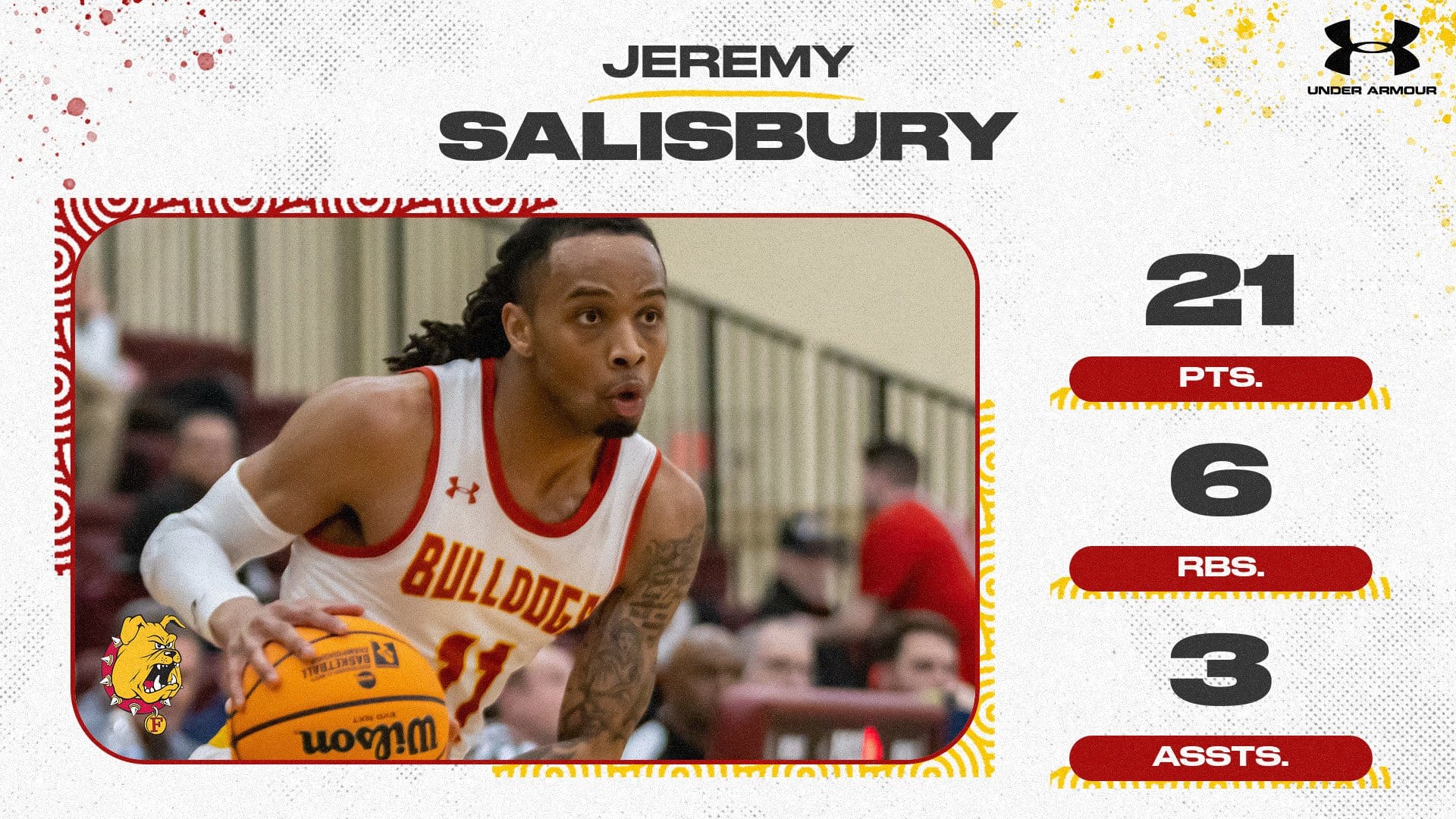
Continuity is key and being able to have a unique, but consistent look helps you create and enhance your brand. This template stays true to the series allowing you to highlight players and student-athlete with up to three stats.

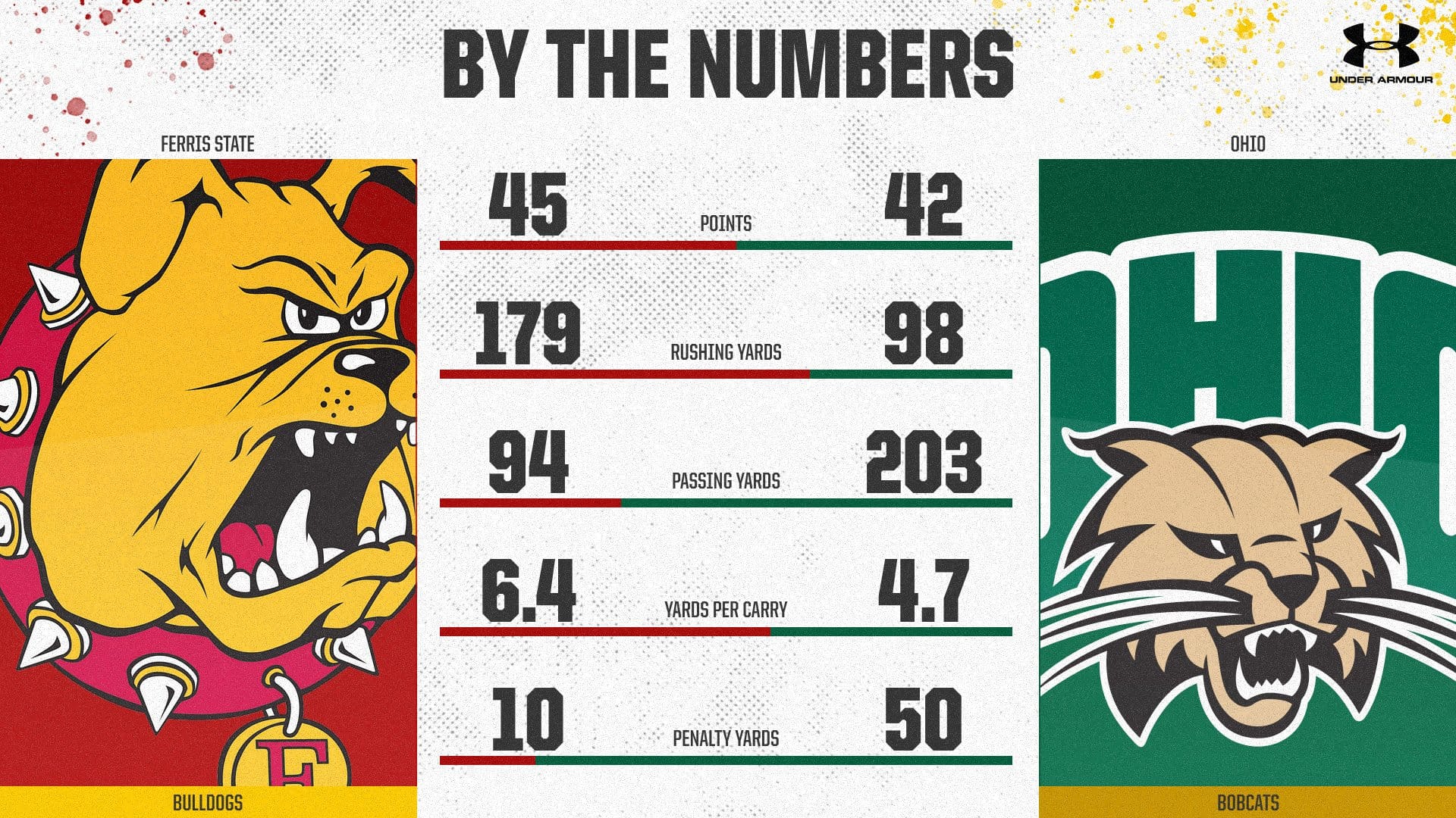
Our matchup graphic gives you the ability to provide a 'tale of the tape' breaking down key statistics between you and your opponent, or for halftime and final stats.
No matter what stats you enter, Box Out will display a horizontal bar graph with team colors showing who had the advantage with that specific stat.

How will you be using the new whisk series? Tag us @BoxOutSports.
Looking for more? Check out our previous releases:


